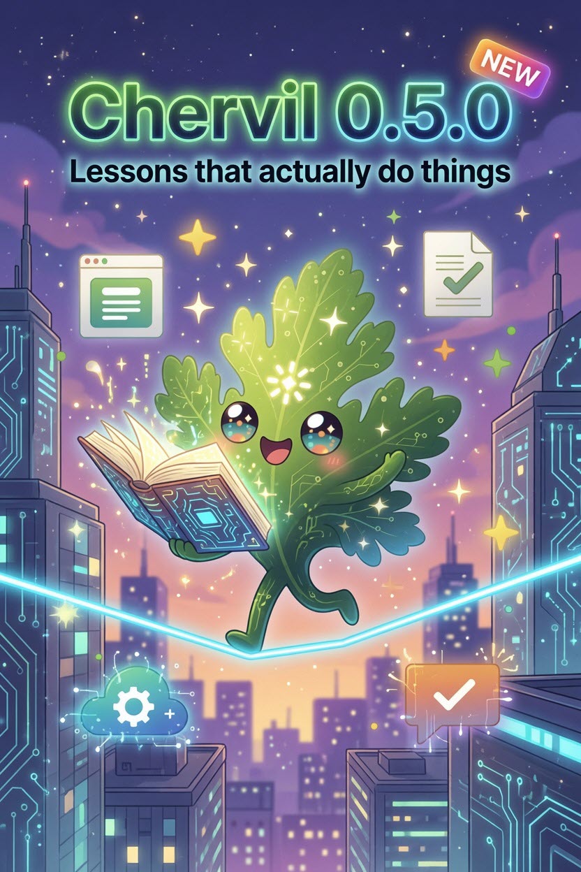
0.4.0 gave your published pages a heartbeat. 0.5.0 is about the learning side finally living up to the word "interactive" — in the app, in your saved lessons, and on the links you share.
"Try it" now actually does something
Ask Sprig to teach you a topic and it builds a lesson out of cards. One of those card types is the applet — a hands-on moment. Until now, hitting Try it with Sprig mostly handed you back a block of text.
Now it composes a real, self-contained interactive widget: dropdowns, inputs, a sortable table, a step-by-step simulator, live-computed output — whatever the lesson calls for. Build a KQL query and watch sample results update. Drag steps into a playbook and run it. It's the difference between reading about a thing and doing it.
A few niceties around it:
- It's instant the second time. Once a widget is built, it's cached for your session — re-open the lesson and it's just there, no rebuild.
- A ↻ Regenerate button if you want a fresh take, and a clean Retry if a build ever hiccups instead of a dead end.
And they work on the web — for everyone, free
Here's the part I'm most happy about. When you publish or export a lesson, each widget is baked into the page as a self-contained, sandboxed mini-app. So the simulator you built doesn't just work on your machine — it works for anyone who opens the link, on any browser, with no account and no "live" anything required.
This is different from 0.4.0's live applets (the Pro ones that call Sprig for fresh data at runtime). These are pre-built and self-contained — they ship inside the page itself, under a hardened security sandbox, and they cost nothing to run. Publishing a lesson now means publishing something people can genuinely use.
Older lessons upgrade themselves
Every lesson you've already made picks up the new renderer the moment you open it — no rebuilding, no re-generating. Open an old lesson, hit a "Try it" card, and it's interactive now too.
A fluent coat of polish
I spent the back half of the week on the kind of UI details that you only notice when they're wrong:
- Settings feels modern — the option you've chosen is highlighted as a card, not just a tiny radio dot, over a soft blurred backdrop.
- The address bar stays usable when the window is small. The toolbar now collapses its buttons to icons (and knows to do it based on the real space it has, sidebar and all) instead of letting controls slide off-screen.
- The sidebar toggle points where it's going — a left chevron to hide the chat panel, a right one to bring it back, with a smooth slide.
- Plus thin themed scrollbars, consistent blur on every panel, keyboard focus rings for accessibility, and friendlier error messages across the app (no more raw
[object Object]).
The little things
- Smart attachments for large files — ask a question of a giant CSV and Chervil pulls the rows that matter to your question, on-device, instead of just the first chunk. The first step toward full indexed retrieval.
Get it
Chervil is free, open source, and bring-your-own-AI. Download for Windows, star it on GitHub, or come say hi on Discord. Hosting & sharing live in Chervil Pro — $8/mo; building lessons and exporting them stays free.